{'Shop Talk' - Newborn Safety & Cyberbullying in the Photography Industry}

It's a 'Shop Talk' day! Yay!

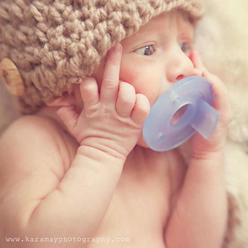
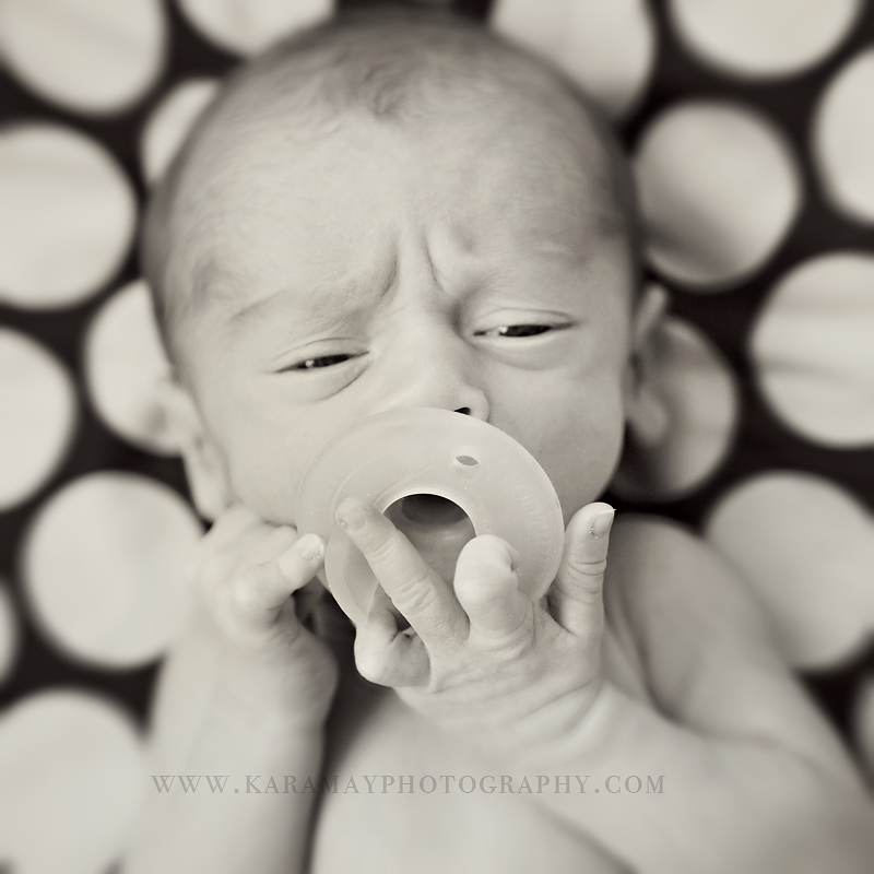
Shocker image above right?  Yes, this is an example of 'non-composite, non-posed' newborn photo (we'll be discussing composite photos below).  It's just a sweet newborn who was not enjoying my camera being in his face.  He was happy with his pacifier and wanted me to leave him alone.  I respectfully did, after this shot and maybe a couple more. :)  Anyway, this image sets the mood for my topic today.

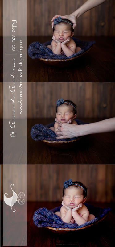
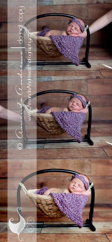
I'm sure you've seen adorable newborn photos of  babies hanging from a whimsical looking tree branch or babies with their heads perfectly propped on their hands. They look so sweet...but how do photographers do this?  Are these babies naturally posing this cute?  A lot of people aren't aware that these are actually composite images.  What's a composite image?  It's taking two (sometimes more) images and meshing them in photoshop to edit out unwanted hands (or other items) assisting in the set up.  Pretty cool trickery ;-)  My friend Amanda is an amazing photographer and her newborn photos are breath-taking.  I wish I had her skills with newborns.  She's the owner of Amanda Andrews Photography located in Boise, Idaho and she let me use these composite photos so you could see what a composite is and how it works.
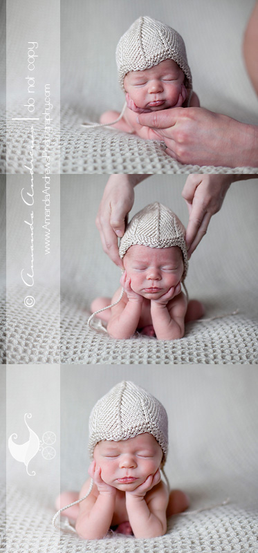
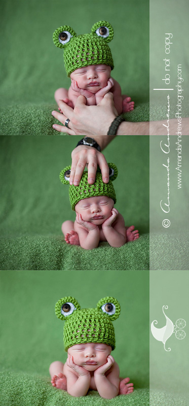
   The results are breathtaking when done properly, as Amanda shows above.  She's aware of safety and makes sure that is top priority.  I'm still in awe over her images and her abilities.  Sigh....

But many new photographers are unaware of this process and want to replicate these images.  Unfortunately safety is compromised without proper information.  As most of  you are aware, this has became a very heated topic in the photography industry as a result.  We are seeing more and more non-traditional newborn set-ups that appear to very dangerous and compromise these fragile babies.  More photographers are sharing their images through social media.  This cyber sharing is bringing to the forefront these dangerous practices.  But we're also seeing blatant attacks on new photographers who don't know about the important safety precautions needed to create these images.  More seasoned photographers are posting these 'unsafe' images on their Facebook pages.  They're including the newborn photographers website as well as watermarked photos along with insults and hurtful words.   This is the catalyst for a string of unconstructive, hurtful comments and image 'shares' (cyber-explosion) on Facebook. The definition of Cyberbullying is: harassing, humiliating, threatening or embarrassing another person through electronic methods, such as instant messaging, email, social networking sites or text messaging. I've watched how quickly this spreads and in a matter of hours I witnessed 1) the post 2)the post being shared 22 times  3) 100+ comments that weren't constructive and   4) the new photographers wall fill page after page with hateful and threatening comments.  Are these pictures okay?  Not really, they're clearly are unsafe.  But is bullying helpful or constructive?  Not at all.  Education and awareness of safe practices are what's helpful and constructive.   Cyberbullying is becoming rampant in our industry I'm embarrassed to admit.  Rather than reaching out to the photographer and providing constructive advice and communicating concern, many are posting hurtful and damaging things about these photographers.  Safety is number one, but there's a way to communicate these concerns.  I reached out to one woman who was cyberbullied by other photographers back in November to see how she was doing and how these comments have affected her.  She told me that she realizes now that she didn't use the safety precautions necessary and she feels awful about that.  She said it wasn't the bullying that helped her realize this, it was one e-mail from a photographer that included safety tips and sites where she could see composites (a practice she wasn't aware of).   But she also said  that all the comments and threatening e-mails have made her leave the industry.   She told me 'she was crushed and completely devastated' by the mean comments and emails she received from photographers and even non-photographers.  She thought she was being safe but later realized that she needed to learn more.  Someone sent her an e-mail threatening to 'hunt her down' and hurt her children, because that's what she could've done to these babies.  Crying became a regular part of her day for weeks.  She still enjoys photography but no longer has a business and still feels grief over the whole incident.  She said that she felt like she 'was an awful human being' for this and it continues to haunt her.  This is the sad result of cyberbullying.  And it needs to stop.  We know better.

So next time you see an image where a newborn looks compromised, please reach out to the photographer who posted the 'unsafe' image and help that person through education.  Our industry is a wonderful one - but we need to be build people up (through education), not knock them down (through cyberbullying).
I'm leaving you with one more of this little guy who clearly wasn't a fan of my camera.  I've convinced him otherwise since this session.  Yay!  Thanks for reading my post.  xoxo


{Project Twenty Six on Fridays - 'the people who keep me sane'}
What an insane week.  Fitting for this week's topic.  So busy, a little sick around here, and feeling so behind.  But I'm excited about this weeks Project 26!  Who keeps me sane?  Those that also make me insane :)  Honestly, I think my kids and my husband keep my sanity in check.  My kids remind me that I need to slow down and enjoy every moment I can with them since it'll be gone if I don't.  They make me laugh, make me cringe, make me think of them before I think of myself (a good thing), and they make me realize that life needs to be more simple sometimes, that I need to think like a 6 and 9 year old  for me to delve into their world.  And I love it.  Sometimes they'll say to me, 'put your iPhone away and just enjoy.' And they are so right.  So I've been trying to be more 'in the moment' with them. For them as well as for my sanity, happiness and the memories that I'm making with them all the time.  And my husband.....he's the calm one.  He's the one who is calm in the mist of a storm while I'm the one who's freaking out.  He's centered and centers me when I'm not so centered.  I like to think we balance each other.  These are the people who keep me sane.

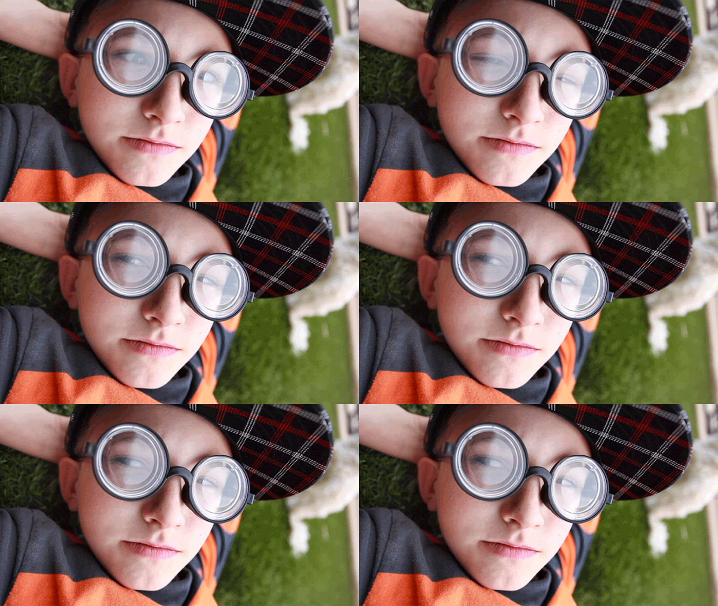
So this week's challenge was coupled with something completely new to me so please don't judge.  This weeks challenge combines the theme of 'those who keep me sane' and the use of either a cinemagraph {a what?} or video.  So what's a cinemagraph?  I had no idea what it was when I heard it was part of our challenge.  A cinemagraph has elements of a still photo but with moving parts.  {note: the first image at the top is not a cinemagraph as you can see, but the ones below are}.  Sounds easy, sounds simple, right?  Then why are the pictures so grainy, and why do they look so blah?  Basically to do a cinemagraph you have to video your subject and use that as your base for the image.  And when you've compressed a video into an image and want to place it on the web, it's going to have some grain as you can see from the images below.  But I used about 74 frames in my image so they are very grainy and blah.  Next time I'm going to try to cut it down to about 7 frames if I can so it will be less pixelated and blah.   But it was fun to try something new and see if I could make it work.

Below, was my first attempt at a cinemagraph.  I didn't use a tripod so you can see that it's shaky - but I had to add is since my son was such a good sport and thought this end result was pretty funny.  :)

And lastly I decided to make a little video of the people in my life who keep me sane.  All the video was taken from my iPhone which was fun and easy.  Sometimes I love the ease of technology :)

Check out Kara Jo’s  project 26 ‘the people who keep me sane’ post – Kara Jo Memphis Newborn and Child Photographer and continue to click through the  links to see the whole circle.

NOTE:  when viewing the video, scroll to the bottom of the blog and turn off the blog's music since there's some silly music on the video. :)  Thanks!

http://www.youtube.com/watch?v=3yHU75DGYfM&feature=context&context=C3002b83ADOEgsToPDskJZ9XfBI5_0aheO8CCZMWqs

{'Shop Talk' - RAW vs. Jpg + 10 Photoshop shortcuts I can't edit without}

It's week 2 of 'Shop Talk' and I have so much to talk about but I'll save my words so I don't overload this post.  :)   Have you ever wondered if you should be shooting in RAW or Jpeg?  It's a question I get a lot from other photographers.  Many aren't sure if they should be shooting in RAW, Jpeg or both.  As we know, RAW files are HUGE and require post processing.  And now that computer processing power is much more affordable  it's not as big of a deal as it was just a couple of  years ago.

So why shoot in jpeg since digital space isn't as big of an issue as it was in the past?  There are some advantages to shooting in jpeg for certain users.  Some photographers prefer the camera to apply the processing algorithms so there is less post-processing after the picture is taken.  The camera applies exposure, white-balance, color, contrast and sharpening processes to the image so you don't have to adjust these in photoshop if your settings were applied accurately to the image.   When you look at a SOOC jpeg image it looks decent and sharable, while a RAW image looks flat, very low contrast and somewhat muted.  Also shooting in jpeg won't drag your camera's speed since the files are compressed.  Okay, so then why would someone opt to shoot in RAW if it adds to your workflow and the images don't look pretty coming out of the camera?

There are so many advantages to shooting in RAW (of course there are drawbacks too, some mentioned above).  You can control exposure, color, white-balance, contrast and sharpening rather than having the camera apply these irreversible settings.   RAW files make batch processing easier when adjusting the saturation, contrast and temperature of all a group of similar images.  Jpeg files can be inconsistent and if adjusted there's a possibility of damaging some of the pixels trying to reverse contrast or another element that was pre-processed into the file.  Also RAW images record a higher dynamic range with the ability to properly bring out more highlights and shadows in post-processing.  Jpegs can be manipulated but not without loss of data.  Even rotating a jpeg image will cause data loss.  When shooting jpeg your cameras firmware compresses the image quickly (so speed is faster since it's making the data output smaller) but in the process there is some range of color that is lost as well as resolution loss.  Jpegs are also grainier because of this compression.

So why not shoot both since you have that option on your camera?  Shooting both RAW and jpeg takes up more room on your memory card.  Additionally, having 2 files of the same image (duplicates) can cause organizational headaches to your filing and editing workflow.  It can be done but I personally don't think it's necessary to shoot in both RAW &  jpeg.

Is there a right or wrong method of shooting?  No.  It's all in what you want, how much control you would like to have and  how much post-processing you want to dedicate to your images.  I personally prefer to shoot in RAW.  For me , I love that I can save a large image with all of the proper information recorded from the cameras sensor to the raw file so there is no data loss and I can have the freedom to manipulate the image how I choose.  And since computers are more powerful and buying storage is getting less expensive , it's not causing as much strain on speed or space than it did in the past.

I hope that clarifies some of the questions and or misconceptions that are out there about file format settings.

10 Photoshop Short-cuts I can't edit without.

I have my mouse set to zoom in and out by scrolling up and down (huge time saver)

Press B - to change to the brush tool

[ - Decrease Brush Size ] – Increase Brush Size Shift+ [ - Decrease Brush Softness by 25% Shift+ ] – Increase Brush Hardness by 25% 1 → 0 – Tool Opacity 10% → 100% Shift+1 → 0 – Flow / Airbrush Opacity 10% → 100%

move the selected layer to be the first or the last one Ctrl + Shift + [ Ctrl + Shift + ]

Alt+Ctrl+G Creates/Releases Clipping Masks

Opt + Shift + "-" or "+" key allow navigation through the blending mode drop-down.

'maintain aspect ration button' (not really a short-cut but a valuable tool - it's the little icon that looks like a chain link) - use when you're cropping, copying and using the free transform tool.

Check back in two weeks for my next 'Shop Talk'.  If you missed last weeks post, click here :)


{My Velvet Owl Interview - Women In Business}

Heidi of owner of the 'Velvet Owl' asked me a while ago if she could interview me for her 'Women in Business' series.  I was flattered.  She posted the interview on her blog today.

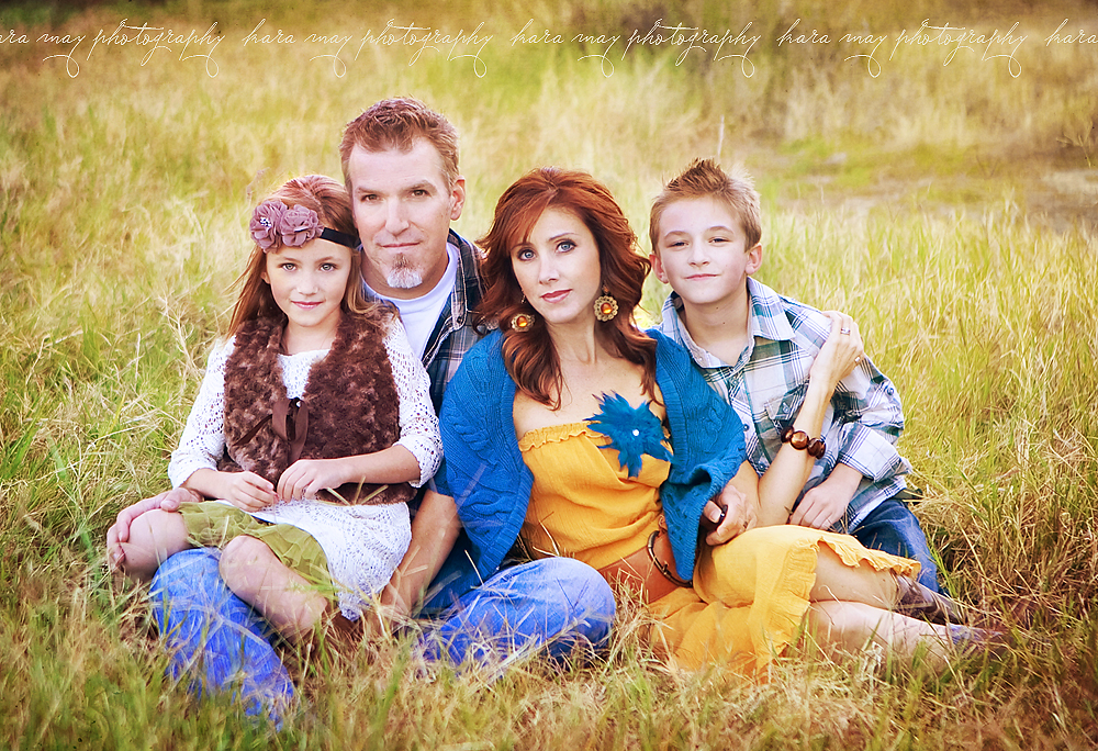
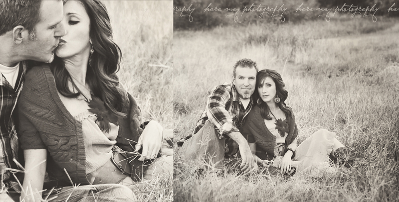
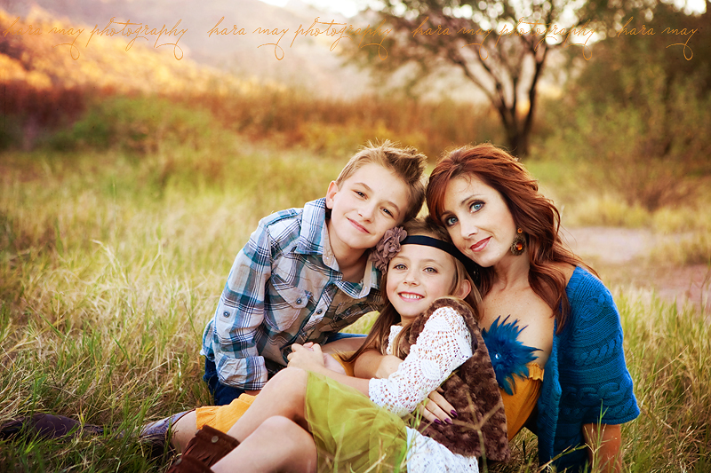
This past fall, the kids, Jeff and I went out to do a family session in timer mode.  Always a challenge but worth a try.  I never posted those images.  I have more but since I'm in a hurry I'll start with just these.  Jeff and I are never alone in pictures....so we let the kids run around so we could have some pictures of just the two of us.  We were laughing most of the time but there were a couple of serious ones lol.   And me with the kids (again, rare for us).   Thank for popping by!

{Project Twenty-Six On Friday's 'let's get close' - Phoenix Children's Photographer}

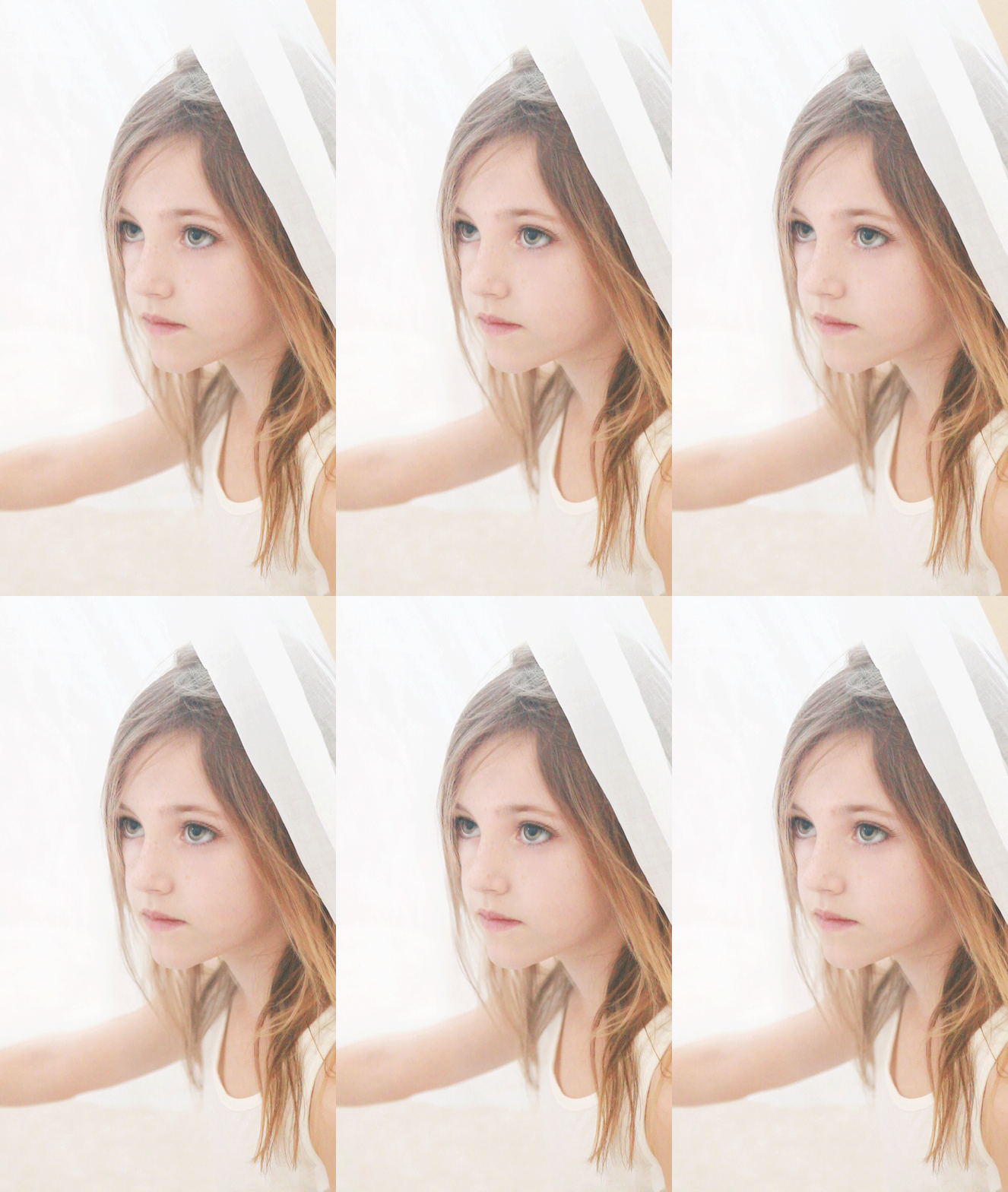
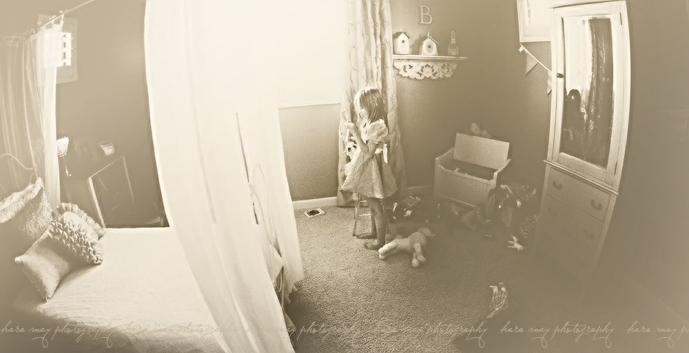
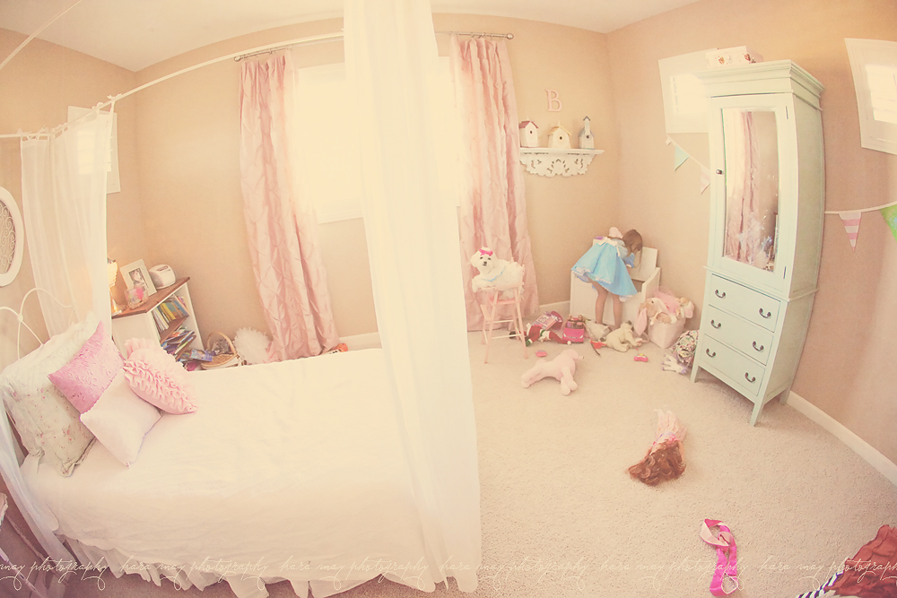
It's that time again...it's the 2nd post of Project Twenty-Six! Here's the first weeks post.   The theme this time is 'let's get close'.  That could mean sooooo many things, so my mind was reeling with thoughts and ideas this week.  It could mean 'close' as in relationships?  It could mean 'close' as in macro shot close?  It could mean 'close' as in proximity close?  I couldn't decide what route to take so I kind of did a  little bit of everything. The first photo above, I focused on unique lighting but if you look closely you can still see the theme 'let's get close'.  Did you find it?  Keep looking.  Yep, it's Brielle looking closely at a ribbon she was trying to un-knot to put on August our pup.  But this image was taken later in the day than the pictures below.  It was after dusk and her room was dark except for the night sky where the moon was shining in.  I set my camera at ISO 6400 (hence the grain) and I put my shutter-speed at 1/20th of a second.   This picture was a bit haunting when I saw it on my computer screen.  Brielle is afraid of her room.  She doesn't like that she can see herself in the mirror from her bed, she thinks that ghosts will get her and she's afraid of  the tissue pom-poms we had hung up but have since taken down.  I've tried to soothe her fears but it's not working to well...slowly we'll get there.  But in looking at this picture I did find it a bit haunting.  Her room is bright and cheery during the day...at night it takes on a different look.

My other takes on this theme - {below} macro of Brielle's eyelashes.

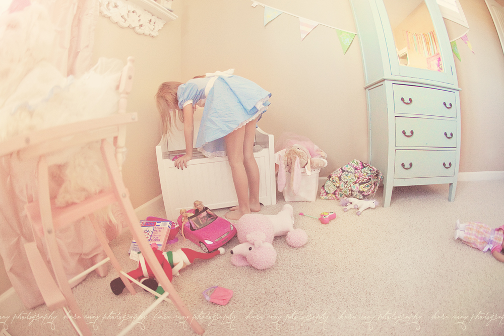
Brielle looking 'closely' in her toy box for the perfect accessory for August, our boy dog, to wear. ;o)

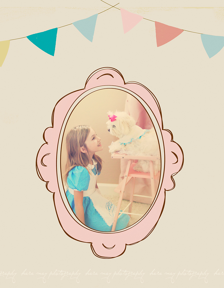
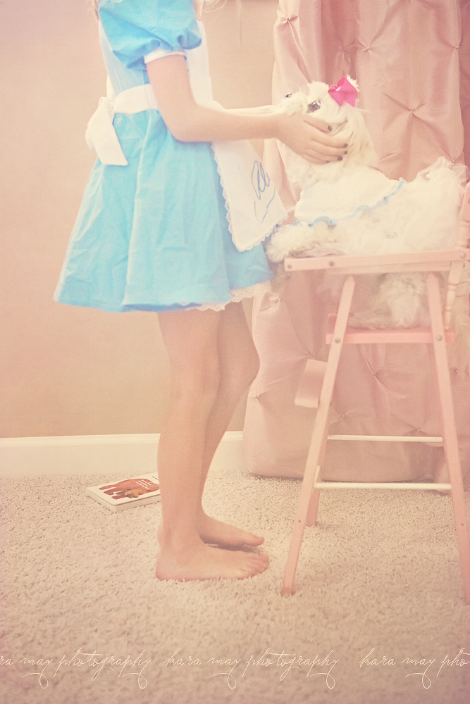
{below}  August, not too sure about being in her babydoll's high chair - Brielle getting close, trying to talk him into liking it. ;o)

{below}  love between Brielle and Auggy.  He's such a good little dog putting up with her dressing him up.

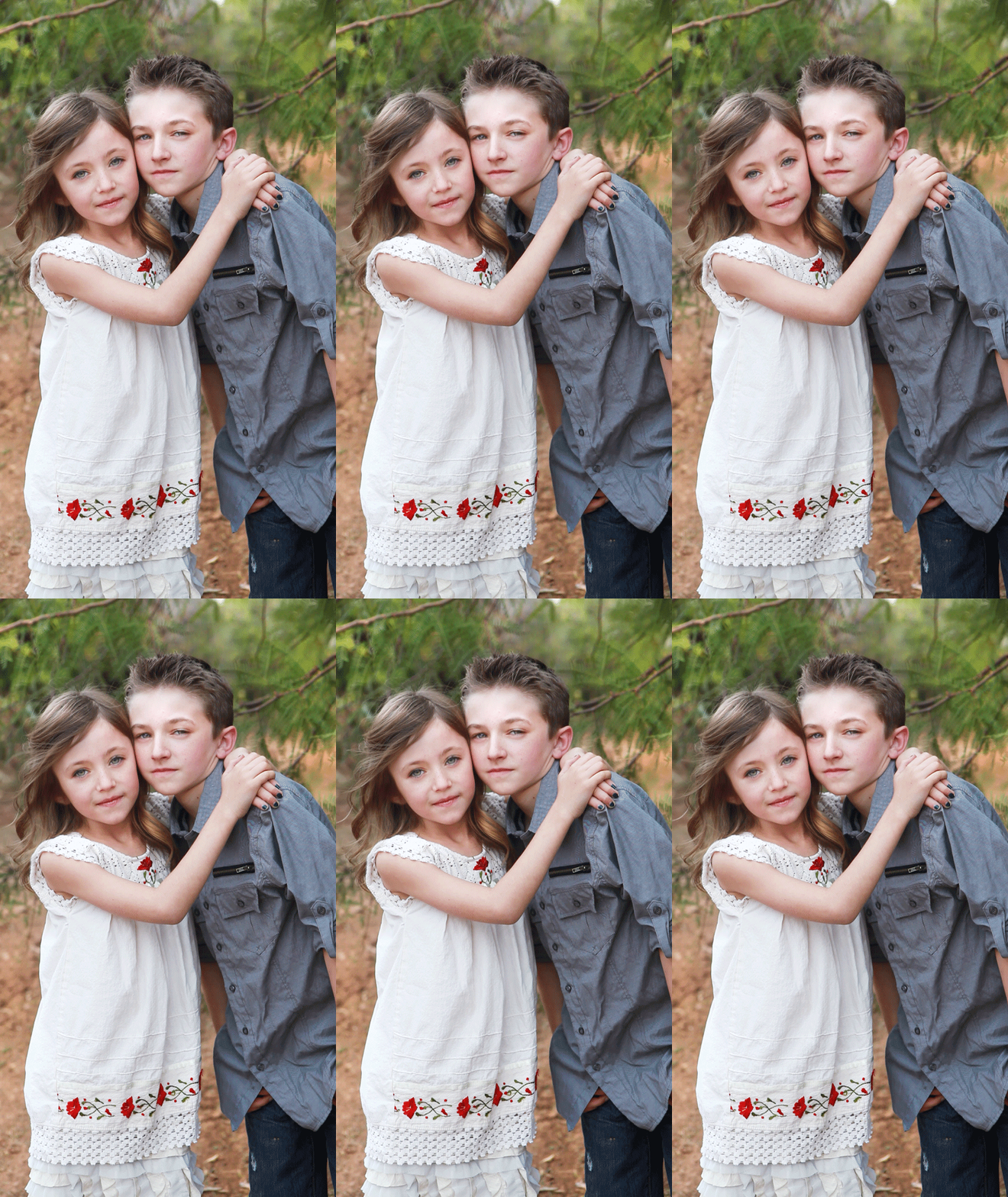
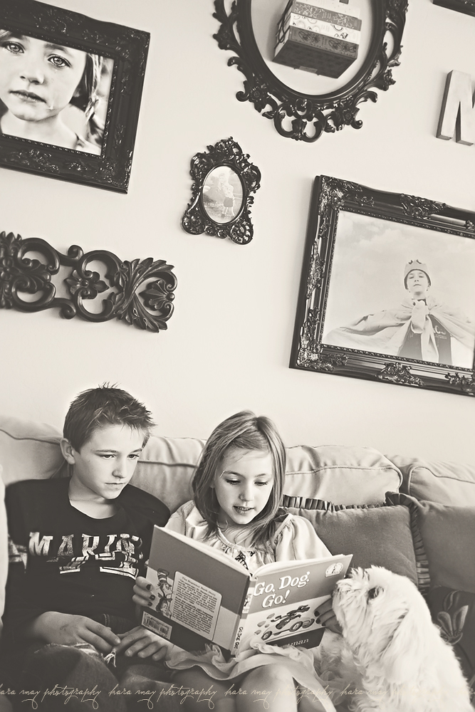
{below}  I saw Ty & B together on Tuesday afternoon reading and grabbed my camera since they were perfect for this 'let's get close' theme. Brielle reading to Ty one of her favorite books since she was a baby.  This was also Ty's favorite book.  When he was 15 months old he wouldn't sleep in his crib without this book with him.  We always handed it to him turned to his favorite page.  That page is very worn now.  We'll never get rid of it - it's so special to both kids.

Now check out Kara Jo’s  project 26 ‘view from up here’ post – Kara Jo Memphis Newborn and Child Photographer and continue to click through the  links to see the whole circle.  Oh and guess what?!   We have a new member - Jessica Drossin - one of my favorite people. Check back again in 2 weeks for our next theme.


{'Shop Talk' - new bi-weekly series}

I'm so excited to start this new series on my blog. This year I'm dedicating more attention to my blog - so in doing that I have some fun things lined up.  I've wanted to do posts for a while now, answering questions I often get in e-mails from other photographers.  But my 'Shop Talk' series is going to encompass so much more.  It's going to be ANYTHING related to photography.  So one week it might focus on photoshop, another on fun photo products available, sessions and another on industry talk.  It will span a huge range and hopefully answer some of the questions I get a lot.  Also, some of the topics will be targeted to those very new to the industry, while others will delve into more advanced topic. Some weeks, you may be thinking 'really?  um, everyone knows that.'  But when we started out, Photoshop was a foreign language so some people won't know how to manipulate a photo's midtones, RGB color channels, or know about certain keyboard short-cuts, copyright information, lens speed, camera care, plug-ins, camera functions, back-focus button, what camera accessories are available, ideas for prints (gifts, display, albums, ect.), opinions on products, how to handle a difficult session and the list goes on.   If you have questions you want answered or topics you want I would love to hear from you.  Just leave me a comment with the topic you want discussed or a question you need answers to.  I'll try to get to all of them as time allows.  Thanks so much for checking this out!

Most of you know that direct 'dodging and burning' to your image is destructive to the pixels.  So to protect the integrity of your photo use a new layer to dodge and burn.

First, add a new layer - fill to 50% Gray and change the blending mode to 'Soft Light'.

Using a soft brush, paint the areas you want to be darkened or lightened toggling between black and white.

Merge the two layers when your happy with the results and no pixels are harmed.

Final results!


{girly girls, balloons & 'trendie treasures' newest dresses}

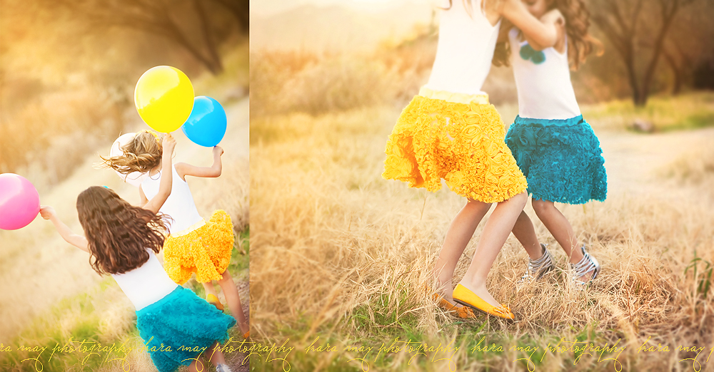
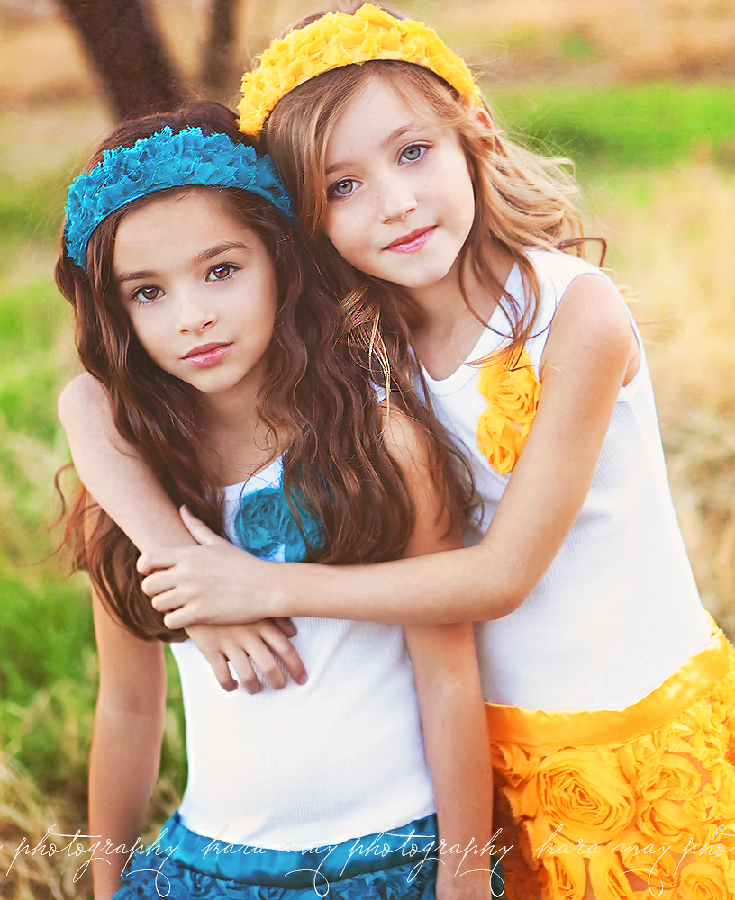
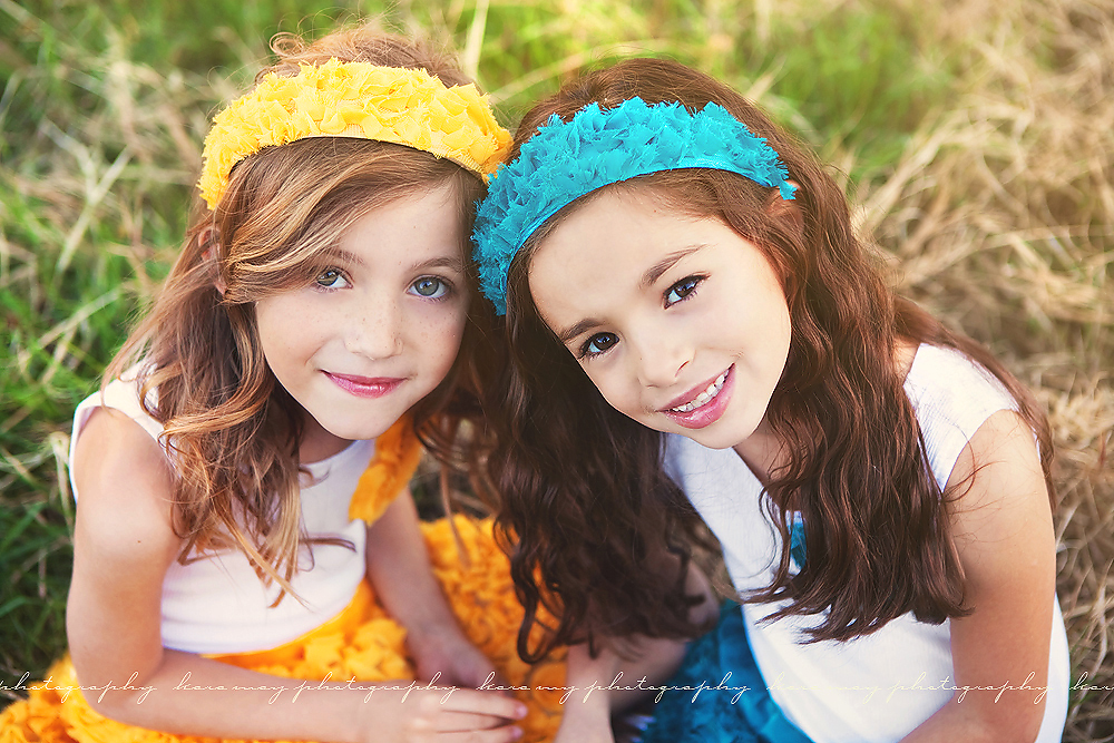
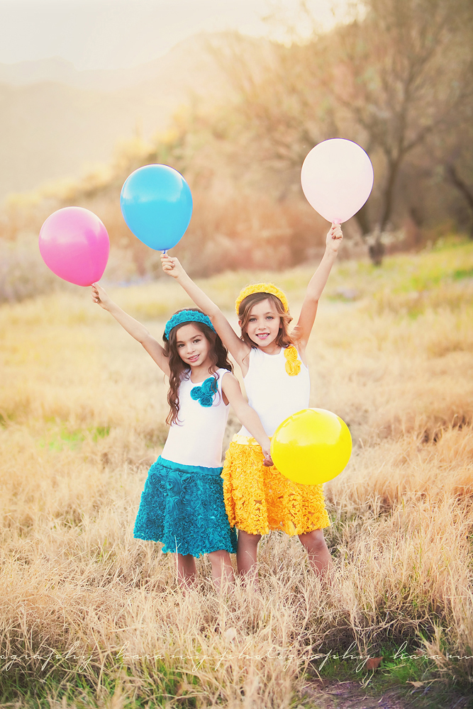
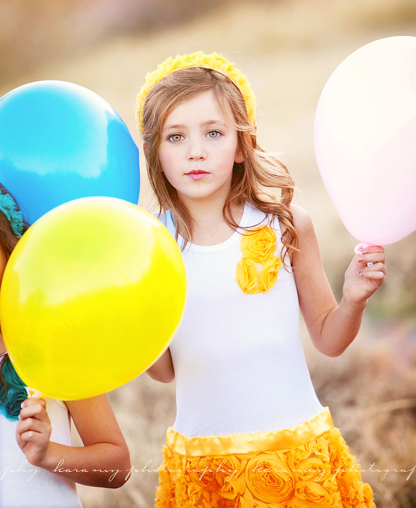
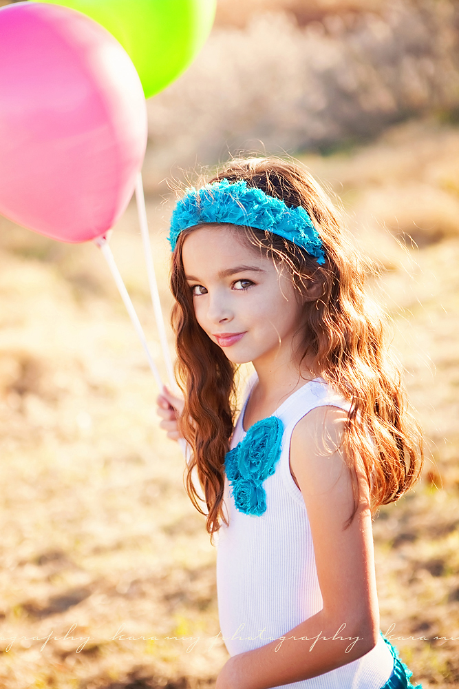
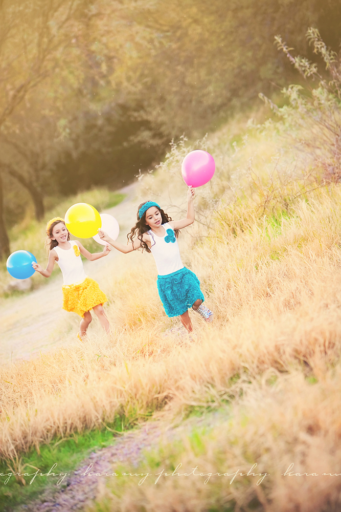
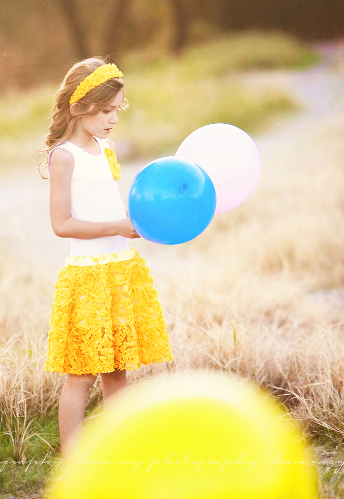
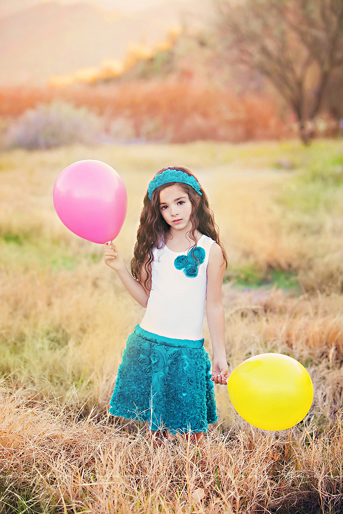
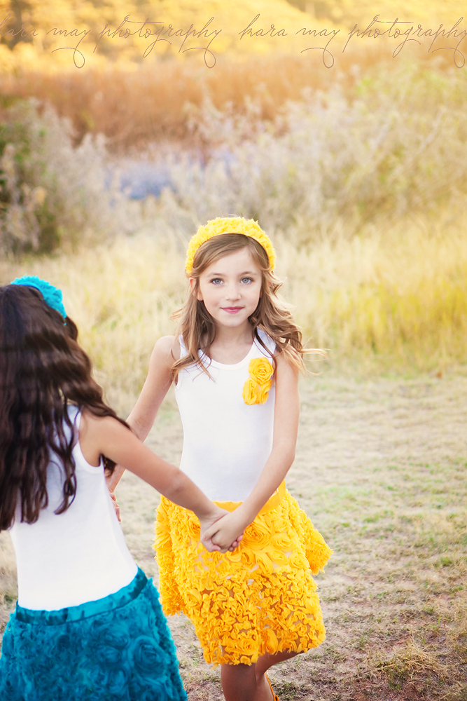
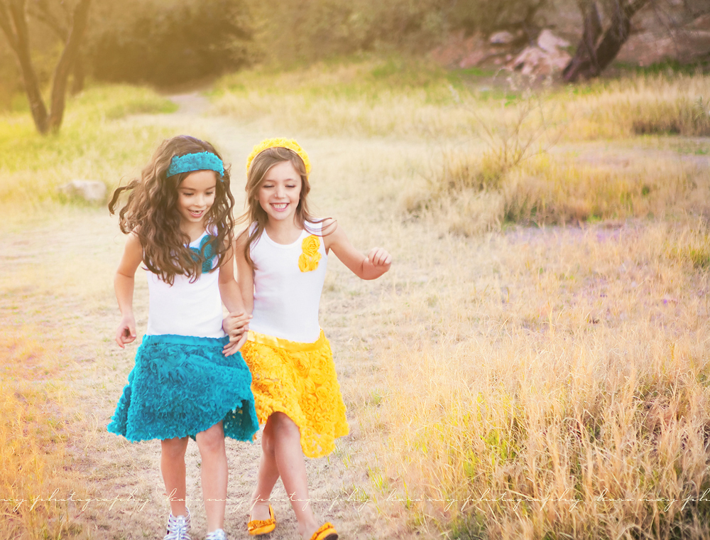
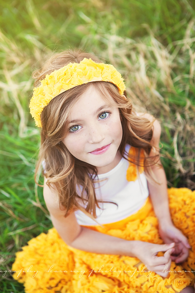
So girly!  That's what I love about these dresses!  They're one of Trendie Treasures latest creations.  Isn't she talented?  I've been working with the designer/owner of Trendie Tresures for a few years now and I always 'ooh and aah' over her newest creations.    I love the soft ruffles, the flowers and the pretty Spring colors too choose from (more colors on her site)!  Brielle and her friend got to play in them for pictures - they were so cute running around being silly together!  If you haven't checked out Trendie Treasures,  you're missing out. Her shop is full of colorful, fun and very girly designs.  Become a fan on Facebook for her newest creations, promotions and the newest happenings with her business.

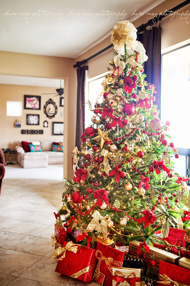
It's still Christmas in our house {blush}

I know, I'm embarrassed to admit this but based on a FB post I made, I'm not alone {whew!}.  Our tree is still up and will be coming down this week - hopefully.  Things have just been too crazy to 'de-Christmas' the house, plus I kind of like it.   I turn on the light when it's pitch black out in the mornings as the kids are eating their breakfast.  It's soothing and the kids like it too.  Although, Tyler did say this morning 'Don't you think we should take the tree down soon Mom?'.  He's right.  And if a child says that....I probably need to listen ;-)


So since it's still Christmas-y here I thought I'd do a teeny holiday post recap.

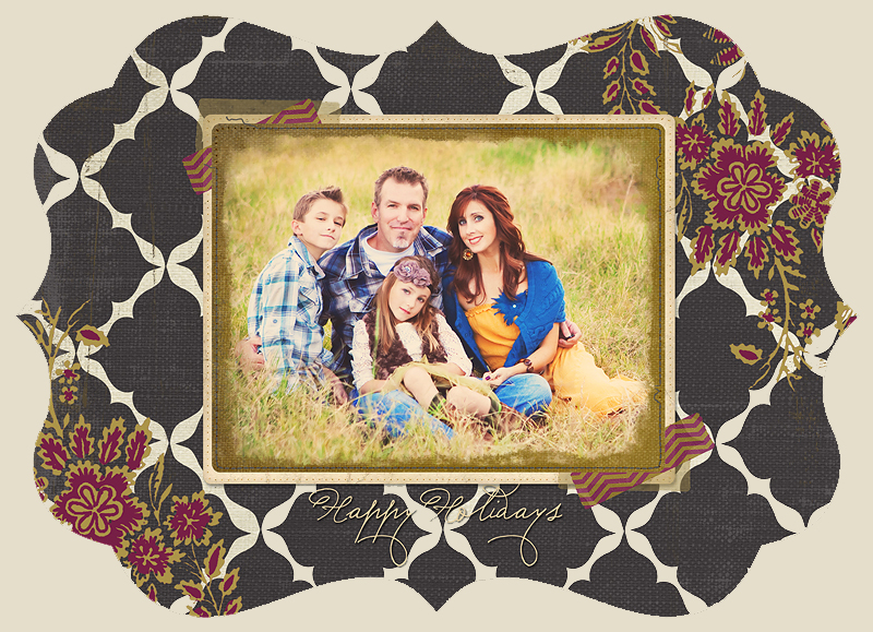
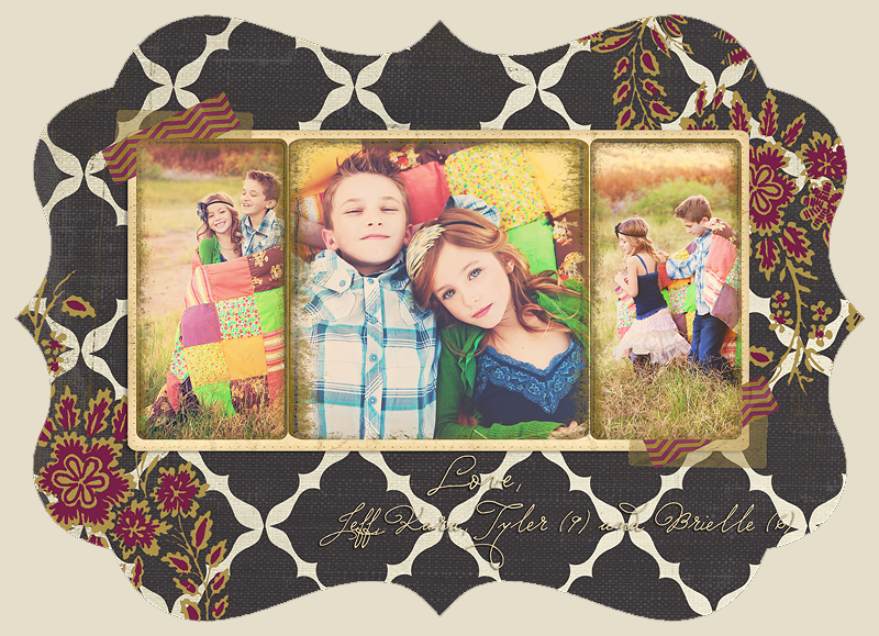
Below is our holiday card... only so much I can do with self-timer  for the family one lol.  The kids look a little gangsa with their non-smiles here.  But we got it done in 15 minutes then they got to run around and play.  Reward!

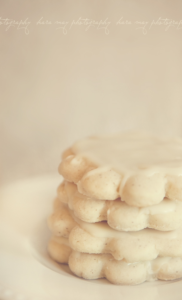
We did a lot of baking!!  I became addicted to these yummy cookies and have to work them off my thighs now ;-)  Recipe below too!

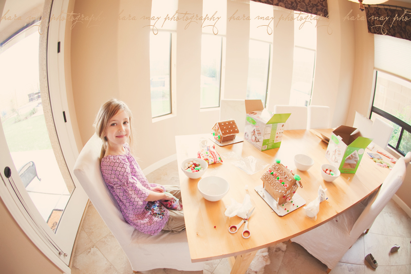
We made gingerbread houses.  I have more pics but to be honest the houses looked like candy threw up all over them so they weren't very picturesque  but they were made with loving little hands :) and I'll have the pictures forever to remember.

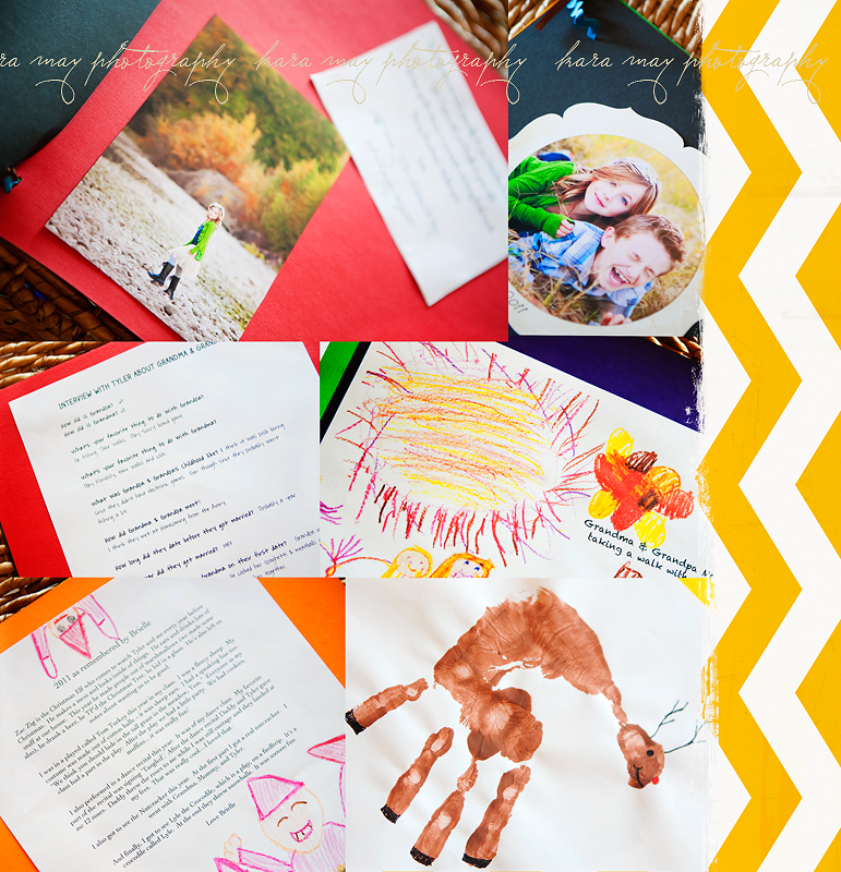
A gift we spent most of the month working on...for both sets of Grandparents.  It's a handmade book with interviews, summary of key events in 2011 as remembered by both kids, pictures, drawings, and other artwork.  Such a fun gift!!

August, our dog got tortured with the various holiday costume we had for him.  He's since forgiven us.

We did the Polar Express in Williams, AZ with friends!  It was also, crazy sweater themed (within our group of 44) so below you may spy some envy-worthy sweaters.  My husbands, on loan from his friend Po, lit up.  It was lovely!


Brielle's Letter to Santa - left for him on Christmas Eve.  The spelling was all her own so don't judge ;-)


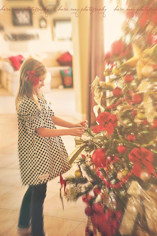
Brielle always rearranging the ornaments I have on the tree.

I hope you all had a wonderful holiday and are off to a great New Year!  :)

{rocky riverbed & autumn colors}

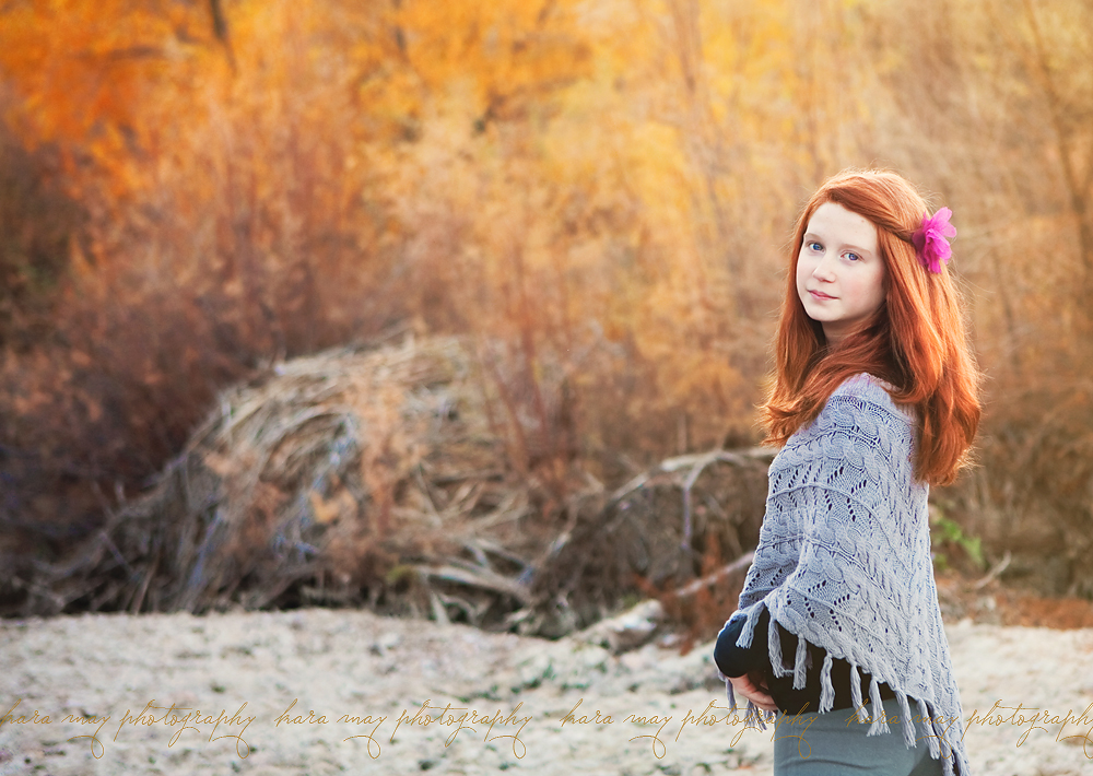
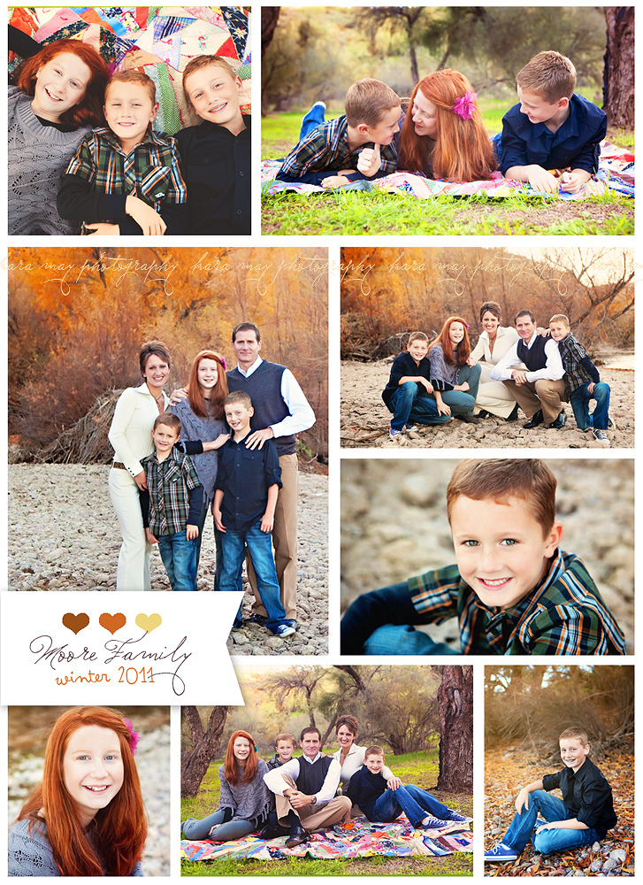
I love this family.  I've known them for almost 3 years now and it was fun to have them in front of my camera!  We shot these on pretty winter day - not too cold and not too warm.  This rocky shore with pretty changing leaves on the trees in the background was a beautiful setting.  It's one of the rare times we 'see Autumn' here in the Arizona valley.  Here's a peek at our session :)